The Top Reasons Potential Leads Click on Calls-to-Action

Click here.
Still here? What, you didn’t click on my call-to-action?
How rude.
Well, you might have a strong reason for it—other than the fact that I didn’t include a hyperlink.
What I failed to do in the first sentence of this post was create a compelling reason for you to want to click further.
All I said was “click here.” There was no mystery there. No sense of motivation.
See Your Potential ROI with leadpops
See what's possible. Fix it fast.
I didn’t answer basic questions, like:
- What will you gain if you click on my call-to-action?
- When will you receive the benefits of clicking on my call-to-action?
- Where is the next step, and how easy is it to achieve?
But that’s why you’re here: to create a more compelling call-to-action that generates clicks.
And in the world of mortgage, real estate, and insurance lead generation, clicks that convert into tangible, qualified leads are every bit as important as phone calls, personal referrals, and more.
Here are the top reasons why people do click on your call-to-action.
Defining the Call-to-Action
First things first: what is a call-to-action?
Book My FREE
Growth Strategy
Session
See what's possible. Fix it fast.

Simply put, it’s the catalyst for converting your website visitors into clients.
The call-to-action is the directive language that draws potential clients to the form, button, or link they click to move ahead in their potential business relationship with you. When you click “Start a Free 30-Day Trial” of leadPops, you’ve engaged my call-to-action.
Capturing mortgage leads, real estate leads, and insurance leads, at some point, will require input from their end.
Once you understand this point, you’ll see the importance of creating a compelling call-to-action. So let’s continue looking at the reasons people do click on them.
Reason #1: You’ve Provoked an Emotion Deep within Them.
Sure, it might be logical to offer quality service.
See Your Potential ROI with leadpops
See what's possible. Fix it fast.
But what’s the emotional reason that you truly resonate with your potential customers?
As it turns out, that emotional reason is far more important in generating leads and referrals for your business.
Your offerings are important, and also a necessity.
They get right down to feelings of security and home when it comes to your potential clients. There are powerful emotional reasons they should inquire about your services.
But that’s not necessarily going to be top of mind for them, unless you bring it to their attention.
If you want to change the way your call-to-action is perceived, then don’t just say “Contact Me.”
Book My FREE
Growth Strategy
Session
See what's possible. Fix it fast.

That’s boring and ineffective.
You might instead say, “Calculate My Reduced Mortgage Rate!”
That generates an emotional reaction in potential clients, and it shows that the next step will be simple.
For insurance, something like: “Get Peace of Mind & Protect Your Loved Ones… Get a FREE Quote Now!”
Reason #2: You Didn’t Ask for Too Much
It’s not a good call-to-action if the button says, “Click Here to Sign Your Life Over to Me!”
See Your Potential ROI with leadpops
See what's possible. Fix it fast.
You’re probably thinking, “Well duh. Who’d ever use something like that?!”
And I do offer that example with tongue-in-cheek…
BUT, in defense of my hyperbole, I see mortgage professionals using “Apply Now” as their primary call-to-action ALL THE TIME, which isn’t all that much different.
Think about it: if I just found you in Google or on social media, or even if a friend referred me to your mortgage business, am I just going to jump into a loan application right off the bat?
Chances are slim, even if you have one of those fancy whiz-bang loan applications that does all the dirty work for me.
Reason is: I’m not ready for that kind of commitment just yet, so don’t use a loan application as your pitch to get me to interact/do business with you.
Book My FREE
Growth Strategy
Session
See what's possible. Fix it fast.

A good call-to-action should be low-commitment. Your potential leads should know that by clicking on your CTA, their day isn’t going to be ruined.
Ideally, things will only get better by engaging with your CTA. Here’s a great example:
Sign up for a FREE 30-Day Trial of leadPops and launch dozens of fresh, engaging, high-conversion landing pages in less than 5 minutes for your mortgage, real estate, or insurance business.
Do you see what I did there?
By pointing you to a free trial, I showed you that you won’t have to do much to acquire your new leadpops services.
That free trial is genuinely low-risk. If you don’t want to buy the service, you don’t.
See Your Potential ROI with leadpops
See what's possible. Fix it fast.
If your own calls-to-action are anything but fun, persuasive, and low-commitment, then that may be the reason that all of those web visitors of yours aren’t turning into genuine leads.
They’re simply afraid of all of the paperwork and commitment that will happen if they click on your CTA.
Let them know that their investment is low. Make the CTA all about getting to the next step. That’s it.
Reason #3: They See How their Life Will Improve by Clicking
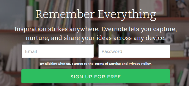
Take a look at the wonderful call-to-action at the Evernote home page:
Book My FREE
Growth Strategy
Session
See what's possible. Fix it fast.

This is a veritable CTA clinic.
With two words, they tell you how your life will improve by signing up with them. You will “Remember Everything.” That’s big. That’s powerful. That’s enough to generate so much interest that you enter your email address on the spot.
Notice that they also have a “Sign Up For Free” button at the bottom.
This isn’t by accident.
They include the word “Free” because they want to show you that they’re low-commitment (Reason #2).
Evernote is doing everything right here. They’re portraying a powerful, professional quality with the design of their website. They’re giving you a compelling reason to move forward. They’re showing that there’s minimal commitment required.
See Your Potential ROI with leadpops
See what's possible. Fix it fast.
And with two words, “Remember Everything,” they tell you exactly how your life will improve.
Ask yourself how your mortgage, real estate, or insurance business can create that kind of compelling reason to click forward.
How will you improve the lives of your clients?
What benefits will they get as a result of working with you?
Then, ask yourself how you can turn those reasons into one simple sentence that communicates it all.
Can you distill it down to two words?
Book My FREE
Growth Strategy
Session
See what's possible. Fix it fast.

Reason #4: You’re Offering Them Something They’ll Use
Simply put, someone will click just about anything once they’re sold on what you’re offering.
In this case, we’re talking about what you can give them online. Maybe your landing page includes a Mortgage Payment Simulator.
If your call-to-action asks for some relevant information and says “Show Me What I Can Afford,” then you’re entering their world. You’re thinking about things from their perspective.
If, on the other hand, your call-to-action simply says, “Mortgage Calculator,” then that’s not very compelling is it?
You have to show your audience that you’re offering them something of use. Something of value…
See Your Potential ROI with leadpops
See what's possible. Fix it fast.
You have to make clicking through worth the time.
Don’t use that time to simply make a sales pitch.
Instead, think about things from the customers’ perspective. If you want to truly access the reason people click calls-to-action, you have to be thinking about what they get out of the deal.
Reason #5: The Call-to-Action is Simple
If your call-to-action is a paragraph long, then it’s going to come across like a major commitment and chances are they’re going to skip right passed it.
A lengthy CTA violates Reason #2.
Book My FREE
Growth Strategy
Session
See what's possible. Fix it fast.

Your call-to-action should be simple. The headline should be no more than a sentence. On the button, aim for no more than five words.
If you can’t whittle down your message to a simple button, then you’re not doing it right doing it right.
Use some bullet points, if need be, but be sure to keep those short and to the point as well.
It starts with the strategy stated previously: you need to put yourself in your customers’ shoes.
But eventually, you do have to craft a cogent, clear message that people will resonate with instantly.
Even if they’re just scanning your page.
See Your Potential ROI with leadpops
See what's possible. Fix it fast.
You see, you don’t have a lot of time to turn a visitor into a genuine lead.
You’ve only got a few seconds before you’ve lost their interest.
If your call-to-action isn’t simple and obvious, then the only thing they’re going to click on is the “back” button, and then chances are they disappear forever.
Don’t let your call-to-action get lost in the shuffle.
Use the methods you’ve read about here, and sign up for a free trial to leadPops now!

